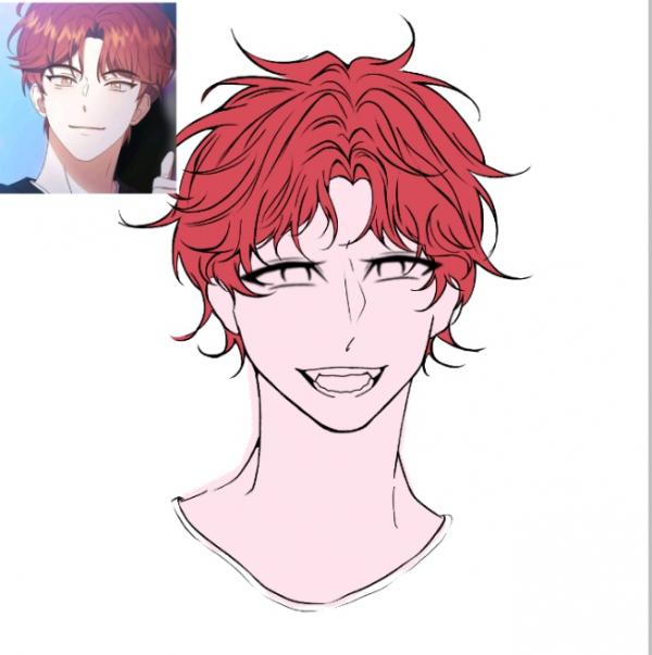
I barely drew for the past few months and didnt have a motivation anymore due to being affected and relating by the great reki kyan disease(non-communicable) of course
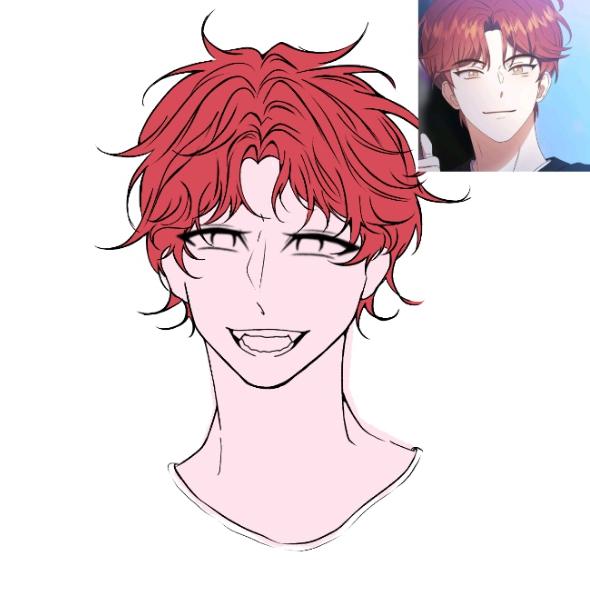
/j but anyways... after trying to draw now and realized that my drawing looks so off.. and js looks awful when flipping the canvas.
SO HOW CAN I FIX THIS?? I dont wanna erase most of it just so I could fix on whats wrong it.. (Im genuinely lazy) I just wanna know if is it the head thats making the face looks so off? or either the eyes and the mouth or yet the nose.. or js all of them☠
(still learning)
pls tell me on what are your thoughts so I could try to fix on whats wrong with it


Messages
looking at the mouth, try to remember when the mouth is open, the jaw will also drop with it, so there should be more space between the bottom lip and the chin.
also looking at the hair, try to think of it in sections. we should be able to the see those front bangs, but then the top of the head should be a bit more obscured behind them. we shouldn't be able to see all the origin points of each strand coming from the head.
somewhat related to the second point, the angle of where you're looking at the character will determine what body parts we can see. If you want a straight-on view, try to keep that in mind.
1. Where are eyebrows
2. You duplicated the eye right? Position is uncanny. Try make them slightly smaller.
3. Related to 2 - Supposed line of the nose shading should not be that close to the eye depending on the lighting.
4. Extend the hair abit, they look like he have a lot of hair but they're sticking to one another but not wet so it looks a little strange.
I guess you don't want comments on the lack of shading and the holeless ears. U know what to do with them I guess. Oh and amazing neck shape btw
first thing i noticed are the eyes, i think it's looking somewhat droopy if you compare it on the reference, next is the missing eyebrows which can really help show what emotion ur drawing is trying to show. Another one is the nose, maybe try shrinking it a little bit because it's making the eyes look like they're so close to each other.