
Few images dont show up
make it so pressing the welcome to paradise takes you back to the homepage, easier navigation
Firstly this website is not only for yoai readers . Has lots of different genre. Since yoai ones reads more they are in front page. Btw i hope you can be successful. İ like website simple and seems useful. But some imagines didn't show up and some pages has 404 error. And lastly i recommend you to use more light colors to use. İt was bit tiring to see that much color. You can look this website as an example for colors. Usually they used dark tones to not catch attention or you can do opposite and use light color for same purpose
I know that you requested tips, but everything I had thought about was already there so... Good job! There is only the issue with the photos, but apart from that there os everything needed in my opinion. I saw the menu, I kind of understood what it was about, but I'm not Dutch so I didn't understand if there is a way to put the objects in order of their prices. From the lowest to the highest or viceversa. If there was it would be cool!
Anyway, I think you did a marvelous work(⌒▽⌒)
Je site ziet er goed uit zo als ik het bekijk maar zoals de andere al hebben gezegd een paar afbeeldingen en pages komen niet tevoorschijn. En bijv bij je blog het eerste geschreven stukje was duits en dan de andere artikelen die ik zag waren verder nederlands. Het is zeker ingewikkeld om te doen en dat snap ik maar ik zou de talen die je gebruikt voor je site wel op de goede taal zetten. Of misschien hoort het zo ik heb geen idee. Maar verder vindt ik je site er goed uitzien! Ik hoop dat dit je wat heeft geholpen.
Sorry als je dit niet helemaal hebt gesnapt. Nederlands is zeker niet mijn beste vak
I like your guy's pictures but on the home page they are off centered - it might be a personal preference but the picture with blank space around it looks a little odd. For example, your "welcome to paradise" is to the right just slightly, and you can tell bc its not aligned with the "brother and sister design studio" logo. And then you scroll down the "Lets get started" is to the left of the center. If thats too nit picky though then ignore me :D Everything else is user friendly!! shopping is fairly easy.
I love posca pens for one thing, but anyway lol, personally if I'd make the welcome to paradise sign out of pens or something , like this: https://www.talisman.co.uk/wp-content/uploads/2015/08/blog-post-image-166-750x380.jpg
to match your pen paradise logo and website color scheme. But have it say Welcome to Paradise, but make the Paradise font look something like this: https://i.pinimg.com/originals/da/83/a5/da83a52eed374e15dc2ed4fb3ded268b.png
or this
https://encrypted-tbn0.gstatic.com/images?q=tbn:ANd9GcRLuoWSN1bS51-6akeJJvnM1d35jsW0wATW8gw3_1h7sYF4saJv&s
if you want to anyway, I'd brainstorm with an artist orca photographer if you can find any to help with dynamic photo-taking and logo/color choice artistry. Try to find a color scheme and make everything those colors to match, so everything blends well together. If you want a sophisticated look, look up examples:
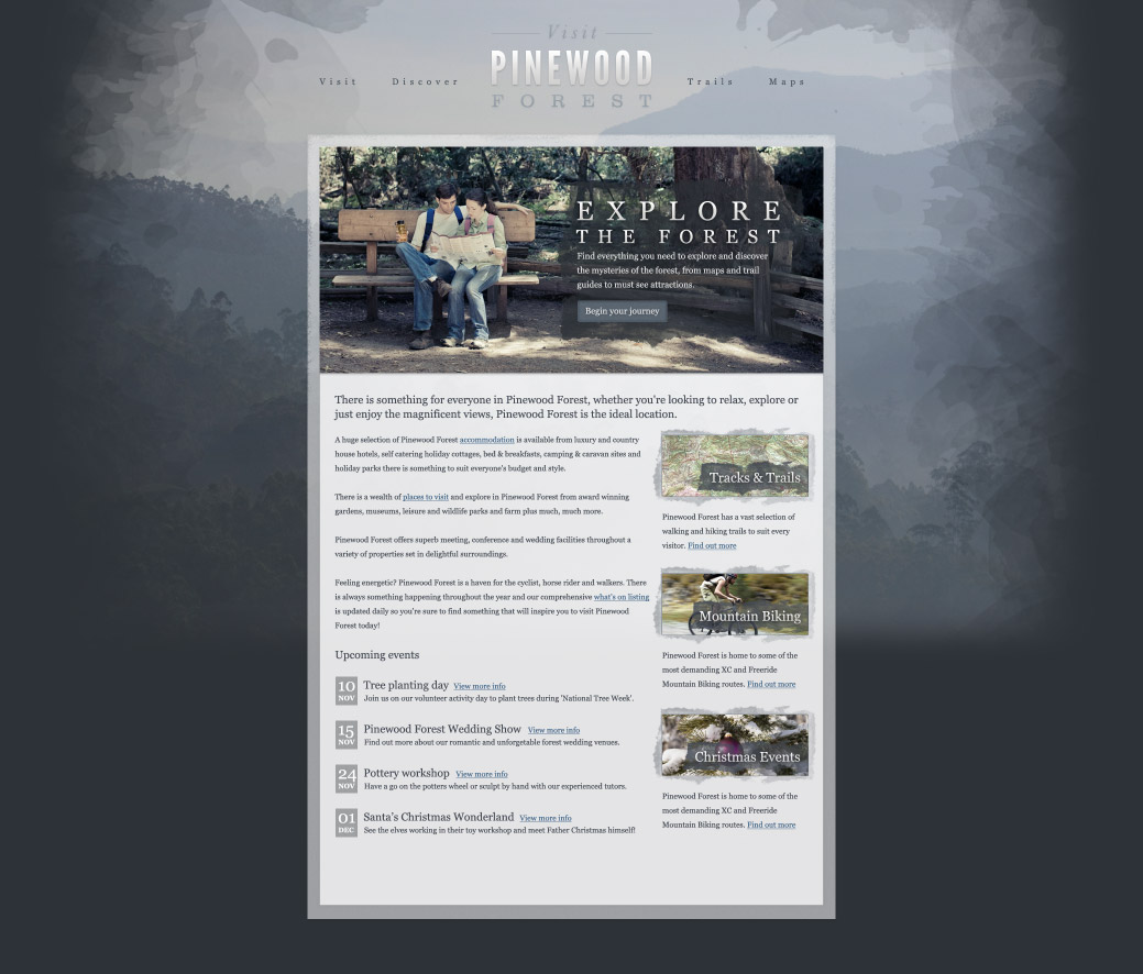
( https://line25.com/wp-content/uploads/2010/pinewood-design/pinewood-forest-web-design.jpg )
( https://dcassetcdn.com/design_img/3153906/43775/43775_17449444_3153906_c2c9e22d_thumbnail.png )
Wanna go beachy or the wooden cabin look?
( https://designrfix.com/wp-content/uploads/2009/09/wood-inspired-website-design-1.jpg)
Look at other sites and example to draw inspiration, but make sure everything matches both the theme and color and you should be fine.
Or even look at professional competitors and see what you like, you can probably even hire someone in web design to give you tips and tricks if need be.
Just try your absolute best and give it everything you've got.
(๑•ㅂ•)و✧ Sry if this doesn't help or just makes things worse lol.
Is this a project your prof uses every year again? Because I could swear I had to help some dutchies with a marker site last year too (not sure if it was on here or in a dutch kpop facebook group haha)
The back to school picture/ad at the bottom should be clickable and redirect to a page with school themed pens & etc. The welcome to paradise picture looks a bit plain, since it's surrounded with so much white and the Pecil Paradise & Brothers and Sisters logos are just hanging in there quite randomly.
I really want to thank all of you who gave us tips or found some errors in our site. y'all are so nice to take some time of your day to help us and the lovely words of encouragement are very sweet. We are still working on it and trying to optimize it, we are all first years and aren't sure yet how to do all the things you guys all suggested. but we will try !! for sure. I think its possible you have seen this site or similar one before, since i think they reuse the sites and the other groups in the study have an identical sites but a different name. The Part that is in German for some reason is not our doing, when we got the site it already had that and we don't know how to change that (yet). We will try to fix the off centered pictures and logos and try softening and matching the colors by your ideas. pictures or errors occurring we are going to ask our teacher about!!
ヾ(❀╹◡╹)ノ~
I know this is basically a Yaoi Site and maybe not the best place but I am Mar, a marketing student from the Netherlands. My group and I have gotten this assignment to make our own website (yeah it is ugly we aren't doing a design study or anything) and to get as much traffic aka visitors on our site.
My question is if you could click on our site https://pencilparadise.com/ and be on it for a minute and just click on a random page or something else. the site is in Dutch though but it doesnt matter if you cant read it.
We sell pens and markers and other art supplies but you don't have to buy anything. since it probably wont ship to your country anyways and the pens are supeerrr expensiveee so just buy them at your local art & crafts store ( ̄∇ ̄")
if you have any remarks or tips tell me! we changed the colors and added some pictures but we aren't sure if people like it.
ヾ(❀╹◡╹)ノ~
thank you in advance from Mar and her Groupproject!
and always keep on reading yaoiii ma boiiiiss